Thursday, August 12, 2010

Turning Over a New Leaf

I have decided that I will do everything in my power to become a great digital painter.

If I want to get a job with Bethesda Softworks or any gaming company, I don't need to do well enough just to get by. I need to impress my employer with a solid and relative portfolio. This means, achieving the status of the prodigies on ConceptArt.org.

It will be a long journey, but in the next three years, you will see me go from mediocre to MIND BLOWING.

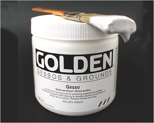
STEP NUMBER 1 - Stop sucking at digital painting by creating embarrassingly bad still life pieces.After these six paintings, I've come to realize that color is my biggest weakness. Everything is unsaturated and muddy. I have to use purer colors and create shadow and light with color other than just value. If anyone would like to offer help, my ConceptArt.org sketchbook is here.

Sunday, April 25, 2010

Update

These pieces range from the beginning of spring to now. Oldest to newest. All from either Figure Drawing II or Painting I.


Saturday, April 24, 2010

Art Has No Boundaries - Amazing, Innovative, Weird, Inspirational - JUST LOOK

I was browsing my favorites on my YouTube account and felt that some of these videos just need to be shared. Be aware of all that you can do with art... Find your niche and GO FOR IT.


Monday, April 12, 2010

The Redline

If you're like me, plenty of work you do never sees the light of day until the moment it is finished and published on an art site (e.g. ConceptArt.org or DeviantArt.com). In short, THIS IS BAD. If you are the only one who looks at your work, you will never realize your mistakes until 10 years later you look back and say "Oh, this arm is out of place".

Show your work to other people even if it is an online community that takes weeks to critique your piece. You'll be glad when you receive one and you'll be even more ecstatic when you receive one of these:


Introducing the "Redline". When an Anonymous donor on one of my favorite critique sites plopped this on my lap, I was struck by lightning. "HOLY COW, MY DUDE IS IMBALANCED." I thought in my head. While I appreciate word-of-mouth (or typed) critiques, nothing is ever so satisfying than this online treat.

What is a Redline?

A redline is a drawing on top of an original drawing, usually done in the color red (hence the name). Someone was kind enough to save your work onto his desktop, open it up in Photoshop, and draw over-top of it while retaining your original idea. This is generally a good thing unless it is obvious the person doing it doesn't know what the hell he's drawing.

What a Redline DOES:
  1. Brings attention to proportion issues - It makes a note of various lengths, widths, and volumes of whatever you are drawing.
  2. Shows mistakes in anatomy - For example, it shows you the correct structure of the face, nose, eyes, mandible, etc.
  3. Helps a character stand correctly so the center of balance is convincing
  4. DEMANDS YOUR EFFORT - You can't just take a redline at face value. You have to recognize your mistakes and shortcomings and use the redline as a guide and not something to be traced or even copied.
What a Redline DOESN'T:
  1. Draws your piece for you - Once again, don't take a redline at face value. You shouldn't trace over top of the redline blindly, but understand the structure and ideas the redliner try to convey to you.
  2. Automatically teaches you every mistake in the original or any drawing you make - Be aware of your mistakes and recognize when you make the same one again in another drawing. That is how you learn from a redline.
  3. Give you permission to ask for more redlines - Redlines are like unicorns in that they are a rare sight and are majestic. Treasure your one redline out of hundreds of drawings.
  4. Guarantee the one who drew the redline is correct - Not everyone knows what they are drawing and just like to pretend they are helpful. Use your common sense to judge a good redline from a bad one.
So, where do I get a Redline?

Hell if I know. This one just popped out of the blue.

http://icrit.org
Post your image and - if you want to - ask politely. Don't expect a hasty response.

That is all.

Thursday, April 1, 2010

How to Clean Gesso out of your Mother's Carpet

(There is no way the title of this post can be a double entendre.)


I AM GESSO, THE BANE OF YOUR EXISTENCE.

NOTE: The lids pop off of these suckers more easily than they seem.

Step 1 - Don't panic.
You've lived a life of honesty and trust so far with your parents. This is just the same as that time you tore off the front bumper of your car against a barrel or that time you punched a hole in the wall with your tv set.


Step 2 - Scoop it up. You know how expensive that shit is! Put it back in the container where it belongs!

Step 3 - Call Mom. Perhaps she'll know what to do what with her experience of being as big a klutz as you (i.e. falling off of a ladder while trying to lean on a wall).

Step 4 - COLD WATER. Use multiple crappy rags soaked in water and scrub, Scrub, SCRUB away. Switch rags when they're covered. Don't fret. You have tons of rags you can toss away.

Step 5 - Vinegar. When the white of the gesso has started to fade away, grab vinegar. Vinegar will dissolve the acrylic in gesso. Scrub away.


Step 6 - Repeat steps 4 and 5 until the gesso is 100% less noticeable than when you first dumped it.

Step 7 - Mourn your wallet. Especially if that was high quality gesso you bought the other day.

Step 8 - Sleep. God, that scrubbing took all of the energy out of me. Sorry, doggies, no walks for the next month.


Sunday, March 28, 2010

I began digitally painting about a week ago. I got a brand new Intuos 4 Wacom tablet for my birthday and have been using it nonstop.

Here are a few things I've done with/without life reference:

Wednesday, March 3, 2010

First Oil

A piece I did in my Painting I class. Apologies for the blur. This was my first color oil painting. My professor is Ed Ahlstrom and he was quite surprised when I told him I have never done an oil painting before. The extent of my painting skill goes as far as one 24" x 30" self-portrait. I have, however, had experience with Sennelier brand oil pastels. They color in a similar way to the paint I was using, but Prof. Ahlstrom said they don't count.

A Monet copy I did during a Fall quarter at SCAD in 2009.

Tuesday, March 2, 2010

Gesture

Today, I felt that I had a breakthrough in my Figure Drawing II class. My professor Tendai Johnson always says that you know you've improved as an artist when you "surprise yourself" and I was greatly surprised today when we finished up our gesture drawings. In class, Professor Johnson always begins work with gesture drawings starting with 30 seconds, then 60 seconds, then 2 minutes. As I continued to draw, I noticed how much more overworked my gestures became with the increase in time. On the last drawing, I thought to myself about what people have told me the past few weeks. (Pictured left: A gesture from late 2009)

At the beginning of the winter semester at my current college, Professor Johnson approached me when he noticed how quickly I worked. In regards to the poor quality of my pieces he said that I was impatient. It was shocking to me to hear that, but after a moment, I realized what he said was true. Even in my better pieces, I recalled not ever pondering the way I made a mark or formed a highlight or shadow. I rushed through every part of the figure only thinking of perfection. So, I decided to work more slowly.


Yesterday, I submitted the nude figure (pictured in my last post) to an artwork/critique image board asking for opinions. I mentioned that the piece took 45 minutes and someone commented what I had shown could have been accomplished in five minutes. "This may seem counter-intuitive" he said, "but you should work faster." I thought this was a paradox: I should not be impatient, but I should work faster. After these thoughts came to mind today, I began blocking in values as a gesture rather than creating line or mass. When we posted it up on the wall to view, I was shocked at how good it was. I didn't step back but maybe once during the production of this one gesture and the simple values and planes seemed well-placed. It was a very successful drawing. (mentioned gesture seen below)


Gestures should be one of the first drawing techniques an artist learns, but I never even heard the term until the summer of 2007. My first 100 gesture drawings seemed to follow things I had seen in How-To-Draw books: using circular shapes to describe structure. The problem was, however, that I did not know the first thing about the human body and even if I did, the technique the books encouraged would result in stiff, lifeless figures. As I progressed, I learned to loosen up and view the body as a whole rather than separate pieces and I believe today was a great revelation: to work quickly, but patiently.

I also applied such an idea to the later 30 minute long torso study here:


It's not all perfect, but it's a start.

Monday, March 1, 2010

The quest begins...


Giorgio Morandi, an Italian still-life painter, once said, "A sincere artist is not one who makes a faithful attempt to put on to canvas what is in front of him, but one who tries to create something which is, in itself, a living thing." I have always thought myself a good artist. I always excelled in drawing classes and was more common than not the best in my classes regarding structure, understanding form, light, shadow, and color. However, every once in a while my ego deflates. I realize that I am not as good a drawer or painter as I pretend I am when I hear not rude, but revealing comments that unveil the truth to me. I stand back from my easel and look around at those surrounding mine. If there is one thing that my art lacks, it is character. Character in line and shape, the way an object is formed. My pieces lack the very life Morandi claimed to be in a sincere artist's work and I feel that I have lost the extreme love for drawing I had back when I was younger. I am turning twenty in a few weeks and feel that I am not at the level I hoped to be. I feel like an old hag.

The purpose of creating this blog is to manifest for myself an obligation to come to frequently throughout the week. I will upload pieces I have done, talk about them explaining the goal, and then leave it to be critiqued. I hope to better myself as an artist and learn much more than I thought I knew.

As far as introductions go, my name is Robyn Lott. I was born in Oklahoma and lived there for six years before moving to Maryland in 1996. I've wanted to be an artist for as long as I could hold a crayon in my hand, but never fully realized this until late middle school. I spent several of those years drawing horrible quality anime characters either relating to Pokemon, Digimon, or my own creations. A few years ago, I realized how very little I had progressed and decided to drop almost all of my notions of anime and manga and work harder.

I never had any proper formal art training until I left high school and went to Savannah College of Art and Design (SCAD). I spent one year at the college studying in foundations classes - Drawing I, Drawing II, Figure Drawing, 2D Design, Color Theory - but felt that I was not advanced enough for the school (even though I had won a scholarship) and decided to come home. I now go to my local community college and am continuing to take foundations courses hoping to transfer later this year to University of Maryland Baltimore Campus (UMBC) with an exceptional portfolio... and here we are at the present.

With my intentions, I hope to become better than I am and possibly make a few friends while on blogspot. Thank you for reading my rather superfluous first post and please stay tuned for more.


(Pictures to right and above are recent pieces; from oldest to youngest - feel free to critique)